This logo was a joy to design. It’s so pretty and makes me happy. Which is appropriate since…
Sukha is a Sanskrit and Pali word that is often translated happiness, ease, pleasure or bliss.
Well, that’s all I have to write.
This logo was a joy to design. It’s so pretty and makes me happy. Which is appropriate since…
Sukha is a Sanskrit and Pali word that is often translated happiness, ease, pleasure or bliss.
Well, that’s all I have to write.
Last Updated on March 31, 2016 by Christina Leave a Comment
In the StudioPress.com forum a person asked about having her columns naturally collapse so that the content will be 4 columns where there’s the width for it and, as the viewport decreases in width, the columns will start stacking in to 2 and then 1 column. The column classes that come with Genesis, Bootstrap, and others don’t do that. They use floats. You can use Flexbox or you can use inline-block. Flexbox is still buggy in IE11. We should have World Wide celebrations when IE finally gets their act together, but I don’t see that coming anytime ever.
Since I was working with the current classes she used and tried to make things as simple as possible, I created the following CSS and html to use. If you use the Add Media feature in WordPress to insert the content inside these columns, make sure you use alignment none.
 <!-- begin demo -->

<!--begin inline-block wrapper -->
<div class="inline-block-wrapper">

  <div class="break-point"><!--empty-for-formatting--></div>

   <!--one-fourth.inline-col -->
   <div class="one-fourth inline-col first">
      <img src="http://placehold.it/300x300/d74c08/ffffff" alt="">
      <p>Interim executive leadership</p>
   </div>

   <!--one-fourth.inline-col -->
   <div class="one-fourth inline-col">
      <img src="http://placehold.it/300x300/65ac10/ffffff" alt="">
      <p>Strategic planning and facilitation</p>
   </div>

   <div class="break-point"><!--empty-for-formatting--></div>

   <!--one-fourth.inline-col -->
   <div class="one-fourth inline-col">
      <img src="http://placehold.it/300x300/138394/ffffff" alt="">
      <p>Community engagement</p>
   </div>

   <!--one-fourth.inline-col -->
   <div class="one-fourth inline-col">
      <img src="http://placehold.it/300x300/8634ad/ffffff" alt="">
      <p>Organizational coaching</p>
   </div>


</div>
<!--close inline-block wrapper -->

<!-- end demo -->
You will probably have to adjust the media query value in one or both or make a new one based on your .wrap and the padding and other media queries. This CSS goes after all other CSS in your theme to be safe that it doesn’t interfere with others, though it’s specific and should be fine. Actually, put these after all your CSS because the media queries in your style.css file are pretty specific.
.inline-col.one-fourth {
    margin: 0;
    float: none;
    display: inline-block;
    vertical-align: top;
    width: 150px;
    text-align: center;
}

.inline-block-wrapper {
    text-align: justify;
}

.inline-block-wrapper:after {
    content: '';
    width: 100%;
    display: inline-block;
}

.inline-block-wrapper .break-point {
    display: none
}

@media (max-width:700px) {

	.inline-block-wrapper {
	    max-width:450px;
	}

	.inline-block-wrapper .break-point {
	    display: inline-block;
	    width: 100%;
	    height: 1px;
	}
}

@media (max-width:400px) {
	.inline-col.one-fourth {
	    margin: 0 auto;
	    display: block;
	}
}Last Updated on January 25, 2017 by Christina 6 Comments
Do not send me a bug report. Become a paid member of MailChimp and after reading their documentation, if you have an issue, use their support.
The original code last week was messed up in that the the same image was used in all posts, I should have noticed it. Anyway, this code is updated and it works great. Apparently hardly anyone is reading my blog to let me know of issues, which is disheartening.
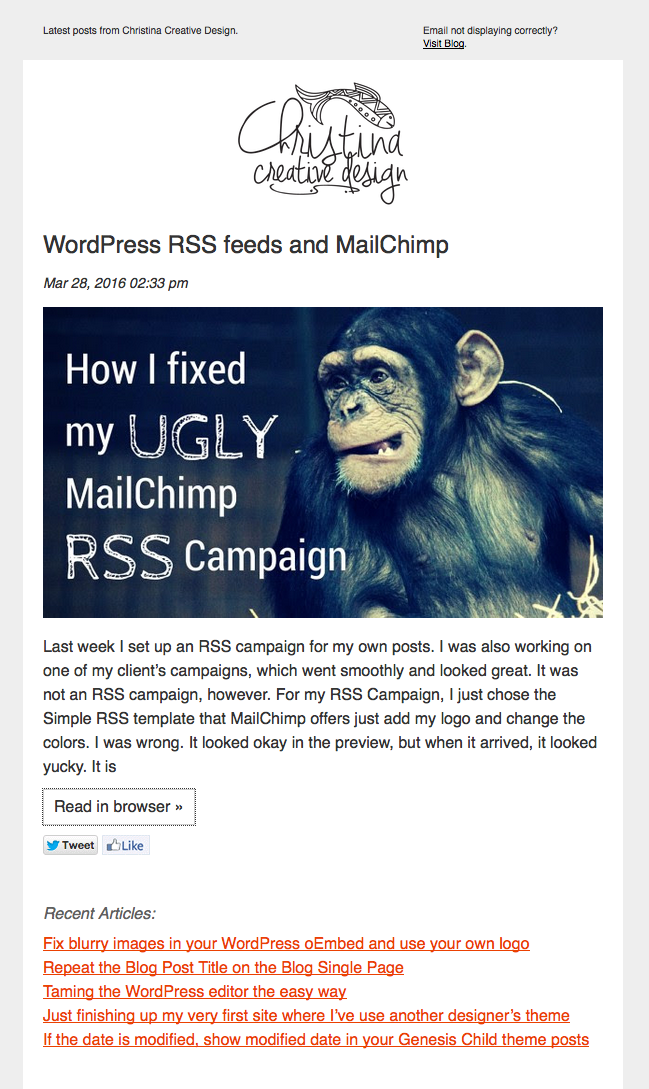
Last week I set up an RSS campaign for my own posts. I was also working on one of my client’s campaigns, which went smoothly and looked great. It was not an RSS campaign, however. For my RSS Campaign, I just chose the Simple RSS template that MailChimp offers just add my logo and change the colors. I was wrong. It looked okay in the preview, but when it arrived, it looked yucky. It is messy and also the padding was gone. I don’t know what happened to the styles. I can’t actually touch the html for the drag and drop template.
I’m not going to bother to figure out what went funky. Instead I did the following:
Note: Images inside tables and inline-block need width:100% not max-width:100% or they won’t resize.
Change your links and logo. Read the html and the notes in the Gist. Please learn how to use MailChimp, this post does not provide duplicate instruction found on their site.
In the campaign, paste the RSS feed items inside the template editor (click on code icon to paste as code):
<div style="margin-bottom:20px;">*|RSSITEMS:|* <h2 class="mc-toc-title" style="line-height:30px;font-size:24px"><a href="*|RSSITEM:URL|*" style="text-decoration:none;color:#333;" target="_blank">*|RSSITEM:TITLE|*</a></h2> <em style="font-size:14px">*|RSSITEM:DATE|*</em><br /> *|RSSITEM:CONTENT_FULL|*<br /> <a href="*|RSSITEM:URL|*" style="background:#fff;color:#333;border:1px solid #ccc;display:inline-block;padding:5px 10px;text-decoration:none;margin:10px 0;" target="_blank">Read in browser »</a><br /> *|RSSITEM:TWITTER|* *|RSSITEM:LIKE|*<br /> <br /> *|END:RSSITEMS|*</div> <h3 class="h3">Recent Articles:</h3> *|RSS:RECENT|*
Thanks to Greg Rickaby for the alternative RSS template tutorial. When you find helpful tutorials or snippets, you have to read the code to change it to your needs and also validate it and correct it. I changed the code to use my image sizes and removed the stuff I didn’t want.
Step 1: Add the following to your functions.php file and change the prefix to yours.
/** ====================================================================================

 * Register Custom RSS Feed for Mailchimp
 * Kudos: https://gregrickaby.com/custom-rss-template-wordpress/

==================================================================================== **/
function christina_rss_template() {
	add_feed( 'mailchimp', 'christina_custom_rss_render' );
}
add_action( 'after_setup_theme', 'christina_rss_template' );

/** ====================================================================================

 * Custom RSS template callback.
 * Kudos: https://gregrickaby.com/custom-rss-template-wordpress/

==================================================================================== **/
function christina_custom_rss_render() {
	get_template_part( 'feed', 'mailchimp' );
}
Step 2: Create a .php file named feed-mailchimp.php and put it in your child theme directory.
This is a corrected version of the one on Greg’s site. It validates with the correct author syntax <author>your@email.com (Your Name)</author> and the description tags.
Remember to change the value of the image handle to your own on line 14.
Your feed url is now http://yourdomain.com/?feed=mailchimp, which is the value you use in MailChimp in their RSS campaign settings.
Now my feed looks nice and clean. I just clicked my link, so ignore the :focus state. Here’s the after, I’m embarrassed by the before.
Note: The preview of your RSS campaign using the *|RSS:RECENT|* will show the current + 5, but on an actual campaign, it will show the previous 5 posts and not the current. Do not send me a bug report. Become a paid member of MailChimp and after reading their documentation, if you have an issue, use their support.

Last Updated on March 22, 2016 by Christina 3 Comments
In late October last year, WordPress.org announced the new embeds feature in 4.4.
I noticed that some WordPress sites I embedded, including my own, had blurry featured images and the WordPress logo instead of their own. This post will instruct you how to correct this.
First let’s get some history, you are not going to touch the WP core. If you look at the /wp-includes/embed-template.php file (4.4) or the /wp-includes/theme-compat/embed-content.php (4.5), you’ll notice that the script is working some php math to find the ratio for rectangular images. If your best fit for that rectangular image ratio is an image size (add_image_size) that is small, then the resulting embed will be blurry across the web. To check if your site’s embed is blurry (you must be updated to WordPress 4.4x), paste in a url to one of your blog posts in another post in draft mode. You can use the visual mode for this test. In a couple seconds, your post will show up like the one below. If you have a featured image on that post, that will show up as well.
https://christinacreativedesign.com/force-the-read-more-link-on-excerpts-even-if-the-content-is-below-the-threshold-andor-custom-excerpt/
First you need to find a size that will work for your particular images, since mine are rectangular and look good at 900×500 on my blog page and the original image uses the best ratio for both Facebook and Twitter Cards (1200 X 626) so that the image is not cropped off, I added this size to my images:
add_image_size( 'embed-image', 600, 333, array( 'center', 'top' ) );
Then, rather than running all my images through regeneration, I name my images so that they are easy to find, and I just regenerated the thumbnails on those. I recommend that you do small batches at a time when you regenerate your thumbnails.
To force this most reasonably sized image, I use the embed_thumbnail_image_size (found in the embed-template.php or embed-content.php mentioned earlier) filter in my functions.php file and I use the 'embed-image' in the variable content. That’s it! Cache clearing is a good idea. If I didn’t use WP Rocket, I would then visit the popular pages on my site (WP Rocket will preload cache, so it ROCKS).
Be sure to ONLY use FTP and a code editor and make sure you are well outside other functions. Also, if your name is not Christina, change the prefix.
/** ====================================================================================

 * embed: filter to make my embed image look best

==================================================================================== **/
function christina_default_oembed_image_size() {

    $image_size = 'embed-image';

    return $image_size;
}
add_filter( 'embed_thumbnail_image_size', 'christina_default_oembed_image_size' );You need to have a square image of your logo at 64X64 or higher (but not crazy high). I created a huge square site icon and then used Makeappicon.com and put them in my root since many devices see these without adding cruft to my head. For the .ico and smaller .png sizes, don’t use the generated version and make your own small versions since the quality can get crappy sizing down. Tip: Photoshop, open up your icon, save as a different name, then size it down in 10px increments and use the setting for reduction (can’t remember offhand).
/** ====================================================================================

 * embed: replace WP logo with my own logo / icon

==================================================================================== **/
function christina_oembed_site_title() {

    $site_title = sprintf(
	'<a href="%s" target="_top"><img src="%s" srcset="%s 2x" width="32" height="32" alt="Christina Creative Design" class="wp-embed-site-icon"/><span>%s</span></a>',
	esc_url( home_url() ),
	esc_url( get_site_icon_url( 32, site_url( '/apple-touch-icon-72x72.png' ) ) ),
	esc_url( get_site_icon_url( 64, site_url( '/apple-touch-icon-72x72.png' ) ) ),
	esc_html( get_bloginfo( 'name' ) )
    );

    return $site_title;
}
add_filter( 'embed_site_title_html', 'christina_oembed_site_title' );Last Updated on March 17, 2016 by Christina Leave a Comment
I’m using a theme made by another designer as a starting point for the very first time since I started in 1999. I’m finishing up on this and am waiting for some content and a few other things.
The client and I agreed that Outreach Pro by StudioPress is the one that would best fit their organization, which is really the Royal family in-exile and their friends who are trying to get the world to notice what is happening to the Miskito people (it’s horrible). They are not rich by any means and need all the help they can get. When the site is live, I’ll write more about it.
StudioPress many beautiful themes to start with and their code is just super clean to work with. I don’t like tons of style options, and this theme doesn’t have many style options (you can change the color combos). However, styles are for CSS to handle.
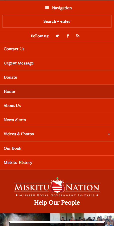
I made a number of changes, but I won’t cover them here. I did want to share how the menu looks on small devices. I have this pet peeve that navigation should be at the very top on small devices (because, unless you’re selling your actual logo, it’s not what people coming to your site are looking for), so I put the menu on the top of the site and both menus are combined with jQuery. I also turned off Superfish on small viewports and use clicks to get to the child menus. I prefer click menus (like this site), but I’m keeping Superfish for the larger viewports (it works great on touch devices).

I'm a freelance print and website designer and developer located in Tampa Bay, Florida. I focus on custom, fast, and beautiful mobile-first WordPress themes. For most small business requirements, I do everything in-house. I also offer additional graphic design services such as logos, brochures, business cards, and other marketing collateral.
